
UX Design | Tax Accounting Firm Client Portal
Note: designs may differ from implementation
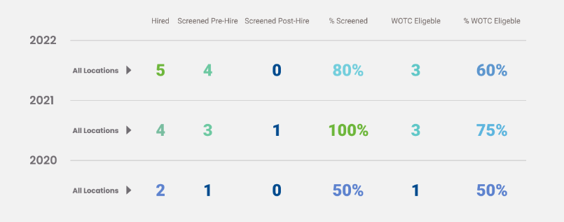
Overlayed Graphs Designed by Eos Chu
This tax accounting firm brought Eos on after being underwhelmed by a previous designer. The challenge: transform dense, specialized information into something clear, approachable, and even fun to use.
To fully understand the complexities of tax law, compliance, and account management, Eos conducted interviews with subject matter experts across the company. The CTO later praised Eos’s commitment to learning the domain in depth, noting how that effort directly shaped the quality of the final product. Eos takes pride in that feedback—and strives to make every client feel just as understood and well cared for.
Among the many improvements, Eos is especially proud of the Compliance Summary pages and both the compact and expanded versions of the Dashboard. These key features, all innovated by Eos, included:
Overlaid graphs comparing data from multiple years, branches, or timeframes (year, quarter, month) for clearer insights
Dual-axis charts displaying both totals and percentages simultaneously
Interactive timeline graphs that stretch across the full page, featuring a movable playhead for exploring specific dates—adding both functionality and a visually engaging alternative to static decoration
Collapsible data groups and user-controlled totals to reduce complexity and support focused, customizable views
Horizontal dropdown menus for navigation that preserve context by never obscuring page content
Color-coded tables to visually ground pages full of numerical data


Accessibility and clarity were guiding principles throughout the portal project. Eos used colorblind-friendly shapes in tandem with brand colors to ensure key differences were always visually distinct. Hover states offer definitions for technical terms, helping users who may not be fluent in financial language learn as they go—without frustration or friction.
One standout feature is the dynamic table highlight system. As users move their cursor across a table, intersecting rows and columns are subtly highlighted, making it easier to trace values back to their labels. Unlike standard zebra striping, this interaction minimizes cognitive load while improving precision and visual comfort.
Intersecting Table Highlight Designed by Eos Chu
Many of these features share a common goal: empowering users to focus on what matters most while reducing distractions. Eos advocated strongly for design decisions that made the experience more intuitive and inclusive, knowing that improved usability serves both the user and the client company.
Every visual and functional choice was made with intention—balancing clarity, beauty, and performance. Eos believes great design should be elegant, empowering, and accessible to all—and this project was a powerful opportunity to make that belief a reality.
Some examples of aesthetic successes are below. The full design is available upon request.
Tools used: Figma, Adobe Illustrator


